Write a Product Page That Actually Converts - How to with Examples
How to Create a Product Page That Sells
Towards the end of a potential customer's journey down your marketing funnel lies the humble product page. This is the point at which they’re actually viewing your product or service, right before they make the decision to purchase. You’ve really got to pull out all the stops at this point - something to get them over that final obstacle.
For such a seemingly important step in the buying process, a lot of online businesses neglect their product pages, filling them with bland copy or poor-quality images. This is your chance to wrap up all the other various parts of your marketing up into a tidy package, educating the customer on the unique selling points of your product, what problems it can solve, and whether it’s a good fit for them or not.
In this article, you’ll learn what elements to include in a product page, how to write unique copy, and look at some examples. Of course, not every product page has the same needs in terms of amount of copy, so we'll also go over how to decide whether or not to include a description.
To learn how you can start beefing up your product pages to generate more sales, read on.
Product Descriptions
Should I Include a Description?
Sure, a picture might be worth a thousand words - but a picture and 50 words is worth 1050 words!
All jokes aside, not every single product necessarily needs a written description. Depending on the layout or style of your website, any elements except an image or a title might look out of place.
Like most of the elements of your website, product descriptions should be A/B tested to determine their effectiveness. Some products might convert better with a longer, more informative description, or a shorter, bullet-point style, or even with no description at all. There are plenty of reasons why any of these might be the case, but the only way you’ll really know is by running tests and refining your approach.
There are many benefits to writing product descriptions, though - not the least of which is the SEO benefits of doing so. Using specific keywords in the description will help your product appear higher up on a Google search. This is much more difficult to do with images.
What Makes a Good Product Description?
A description is an opportunity to put a potential customer’s concerns about your product to rest. You can include additional information like what the product does, who it’s for, and, if appropriate, its technical specifications.
Good product description copy should:
- Be easy to read. The copy should scan easily to the customer. A big block of text distracts from your product. If you do have a lot of information to convey, like specifications for an electronic device or other complex product, try to do it in a bullet point style that reads more easily.
- Be tailored to your audience. Think about what your target audience will connect with when considering your description’s copy. Humor is a great way of engaging the customer and making your product stand out. Humorous people come off as more likeable, and brands can be much the same. Of course, it’s not always appropriate - maybe don’t be cracking jokes if you’re selling life insurance. Or, for a more realistic example, if you’re in designer clothing retailer, jokes in the copy may not come off as very classy.
- Use relevant keywords. This advice should be utilized all over your website, and your product page is no different. Use an SEO checker https://apps.shopify.com/plug-in-seo to make sure you're using the keywords that will give your products the best chance of showing up in relevant searches.
- Offer a solution to a problem. Your product description should outline some problems the customer might have in their life that your product could solve. It should tell a story that you hold the key to improving their life.
- Give them the option to learn more. Your copy should include all the information people would want to know right off the bat. For example, include information about how your clothing is ethically sourced, or size charts so customers can get the right fit. You can include options for customers who are more curious about the technical specification of your product within drop-down menus or additional links.
- Use high-conversion words. There are lots of lists out there of effective words that actively engage the customer. https://blog.bufferapp.com/words-and-phrases-that-convert-ultimate-list You should be using these words as much as possible - generally, they’re words that focus on the product’s value to the customer or the limited-time nature of an offer.
Product descriptions can vary in length. Check out this example from S’Well, the popular water bottle retailer:
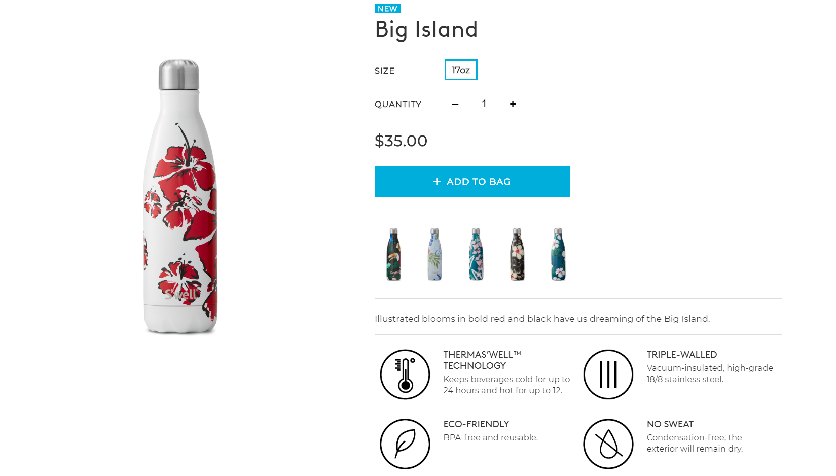
It’s short and simple - but also unique. Obviously, everyone knows what a water bottle is for, so instead of an unnecessary explanation, S’Well has opted for an evocative line, "Illustrated blooms in bold red and black have us dreaming of the Big Island." That sentence conjures images of soothing and relaxation, and the customer can easily make the jump to associating these things with using the product.
Or, it can be even more stripped-down than that. Check out this product page for online wallet retailer Bellroy:
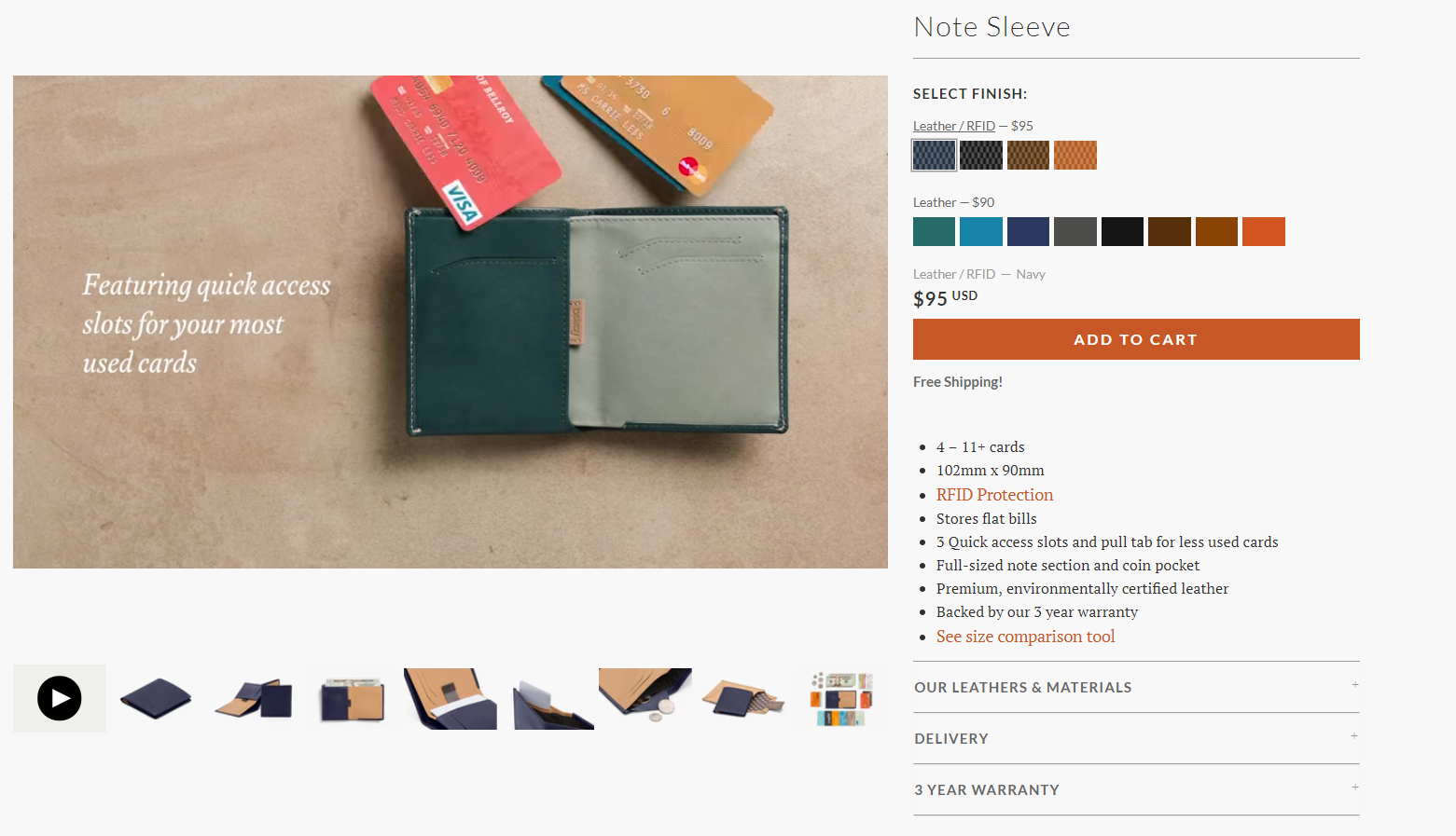
Images of the product are allowed to take center stage - copy is kept to a minimal bullet-point style. Deceptively, a lot of information is offered on this seemingly simple product page - multiple paragraphs of additional information lay within drop-down menus. Again, not every casual browser will be interested in this info. Those who are genuinely interested in purchasing will want to have access to this information, while more casual browsers won't be overwhelmed by a wealth of information.
Glasses Direct takes a slightly different approach:
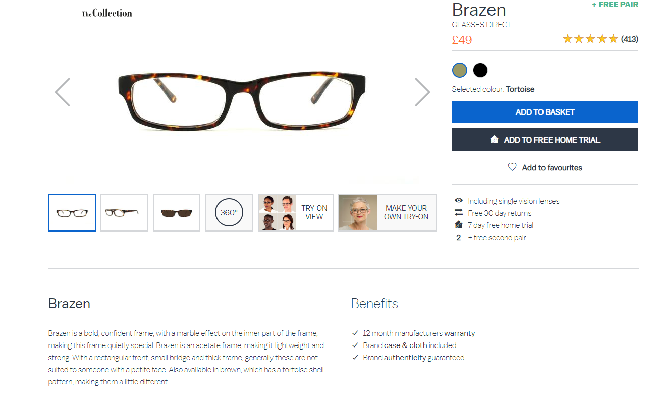
This page uses a little bit more copy, as purchasing a new pair of glasses is a pretty big deal for a lot of people, since they’ll likely wear them every day and they’re something of a fashion statement. Information like “generally these are not suited for someone with a petite face” is very useful for someone who might not know very much about glasses. The copy in no way distracts from the images, but it offers a lot more context to them, describing the material and style in far greater detail.
Images
Of course, it goes without saying that your product description is nothing without attractive, high-resolution images. Nobody’s going to buy a product based on the description alone, and images that seem cheap or poor-quality are going to have a very negative effect on conversion.
There are lots of different ways you can do present your images, from having them take up the bulk of the page to letting text play the more essential role. The demands of your product will have to determine the best option for you.
Whatever you decide, a few things to keep in mind are:
- Ensure consistent image size. If the images aren’t of an equal size on each product page, your website’s going to look sloppy and unprofessional. If you’re concerned customers might want a closer look, ensure that they can zoom in to view finer details themselves.
- Include multiple angles. If appropriate, you should include multiple angles of your product so that the customer will have a better idea of what they’re getting. This will go a long way in helping them to determine if the product is a good fit for them, as well as ensure that what they get is as close to what they were imagining as possible.
- Feel free to explore video content as well. Always remember that you’re not limited to still images - product videos can be a huge booster to conversions. Especially if your product is of a more esoteric or unusual nature - a video demonstration of how it’s used will help the customer understand what it is they’re getting.
American Apparel does a good job with the above tips:
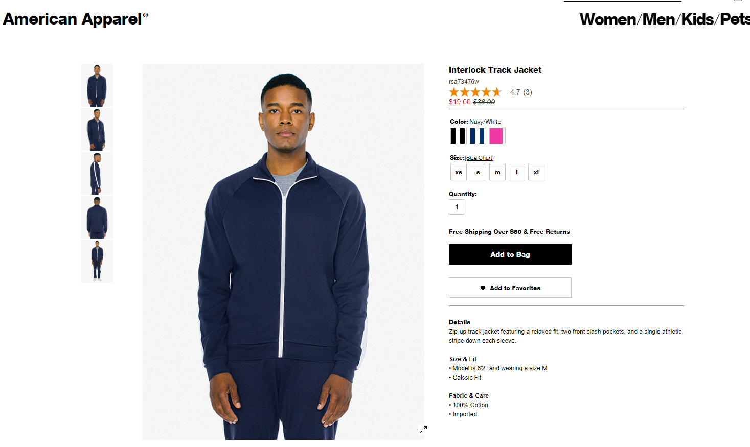
We can clearly see the jacket from all angles, plus an option to zoom in to see finer details of the fabric. If you mouse over one of the other color options, it seamlessly transitions to that color - a feature that’s hugely useful but sometimes overlooked.
Also, bonus points to them for including the model’s height and what size he’s wearing - I can’t tell you how big of a difference that makes for a lot of people. If you're a clothing retailer, customers worrying about getting the right size can be a surprisingly big factor in the bounce rate of your product pages.
Customer Reviews
Testimonials from current customers can have a dramatic impact on prospective ones. You may have testimonials or reviews listed on your home page, but do you have ones specifically relevant to your product pages? While it’s good to have your overall brand appear dependable and well-regarded with general testimonials, your product page’s testimonials are going to be more specific to selling individual products.
If you scroll a little further down on the American Apparel product page we listed earlier:
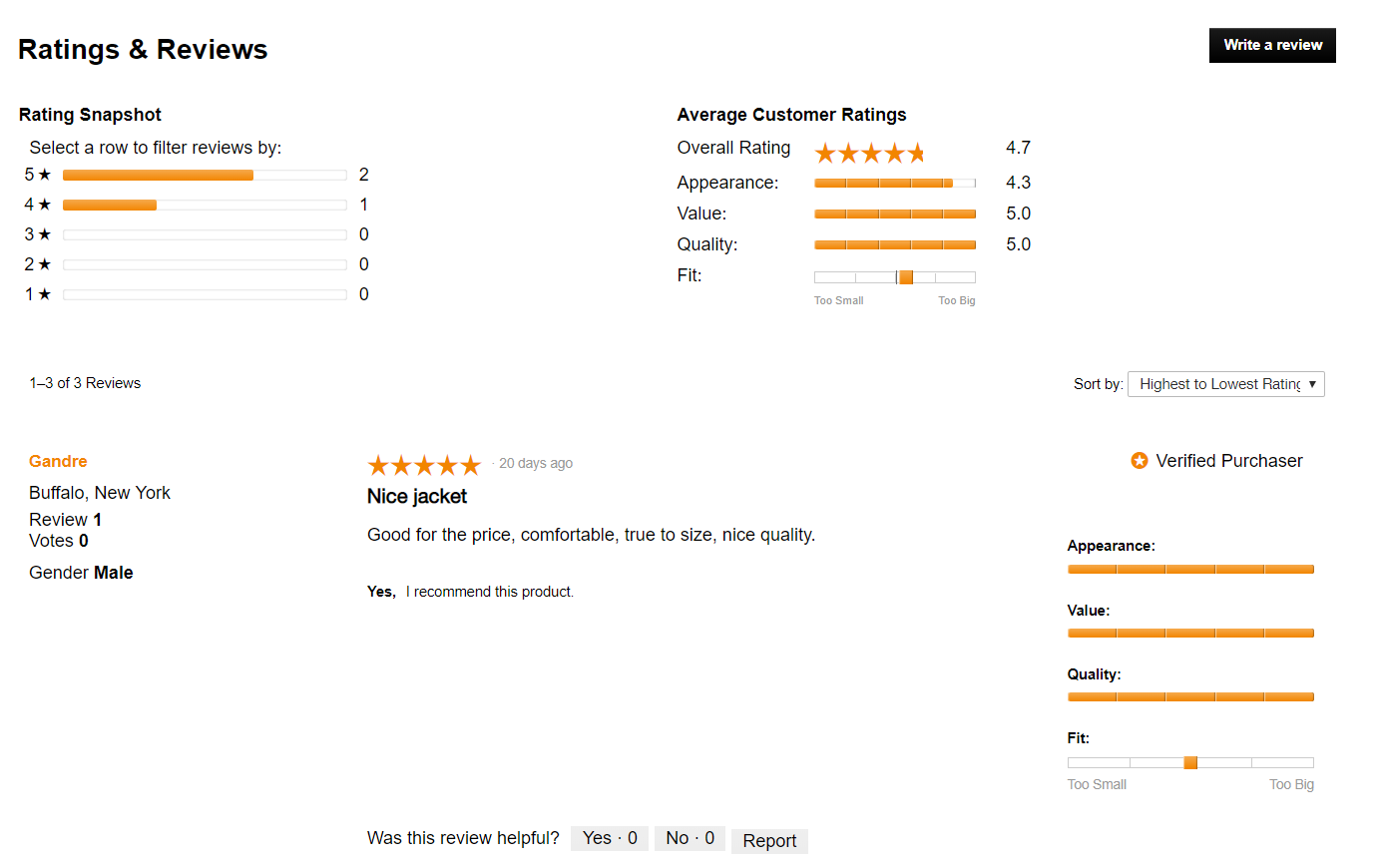
There’s only a handful of reviews, but even so, they still reflect well on the product. Social proof is a powerful tool, and seeing others talking about the specific parts of the product they like can go a long way for your customers.
Reviews can also be a place where customers might find answers to questions that you didn’t even anticipate - like how the product handles certain types of specific situations, or whether or not it fits certain body types well.
Try to get customers to leave a review by offering them a discount on their next purchase, or offering some other incentive. Once you have a decent stockpile, they can be deployed to great effect on your product pages.
Feature Other Products
Of course, the product page needn’t be entirely focused on a single item. You can also include elements on the page promoting other products. This way you’re more likely to rack up more than one sale from a single visit. Plus, even if the product they’re viewing might not be what they’re looking for, who knows if another relevant product could catch their eye that would be?
Jewelry retailer Alex and Ani https://www.alexandani.com does this by simply listing a “wear it with” section under their products:
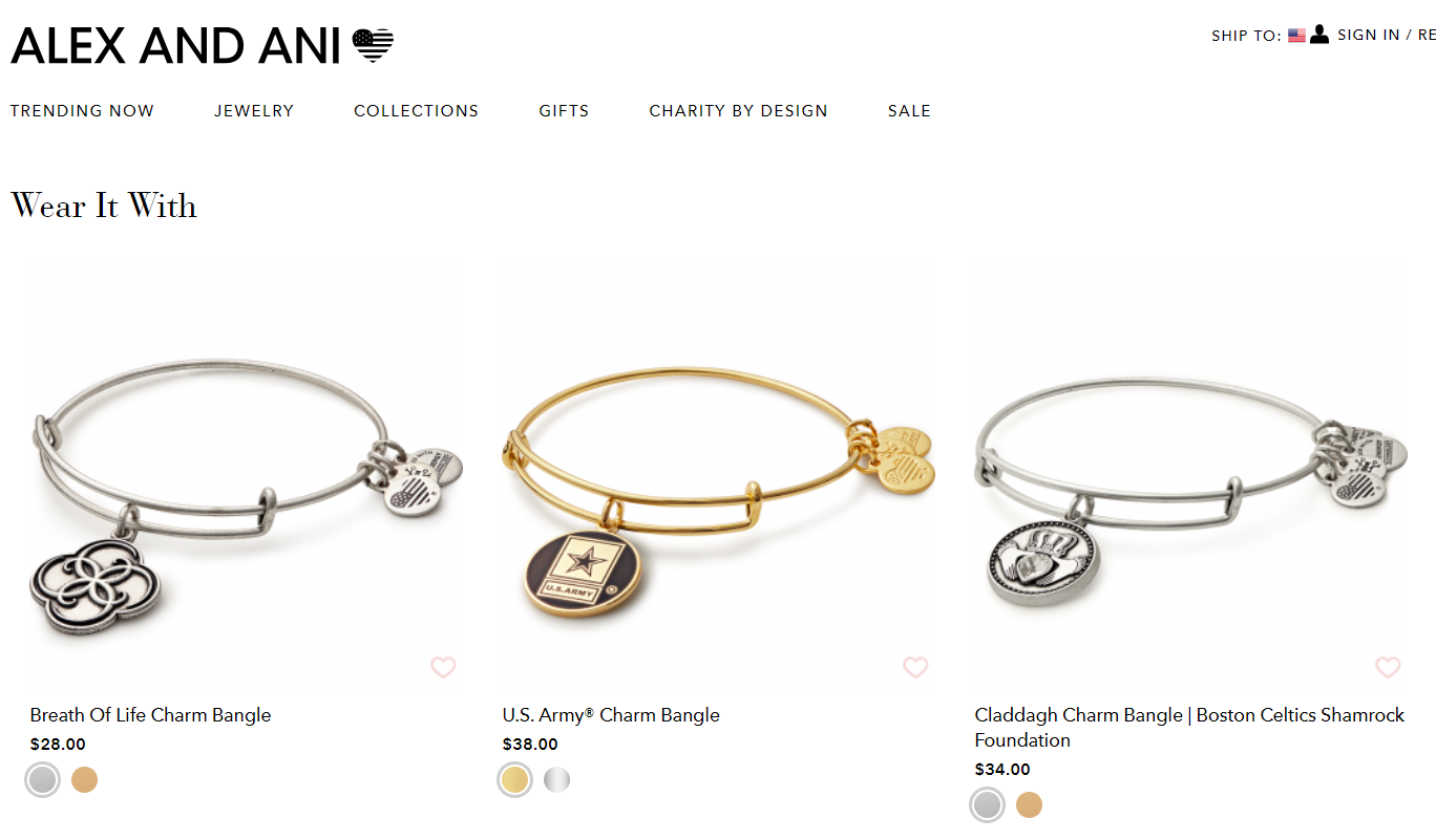
This is a great jumping-off point for Alex and Ani’s customers to start getting some idea of the different ways in which their product can be worn, as well as what other products they can purchase to complete a look.
You can get creative with this, if you want. Try packaging several “frequently bought together” products into a single package at a small discount, or offering free shipping for orders over a certain amount.
Miscellaneous Elements
There are a few other things to do that don’t necessarily fit into their own category. These include:
- Embed social media buttons. This is your chance to let the customers do some of the work in getting the word out about your product. If they’re excited about your product, it should be easy for them to share it on their social media accounts with the touch of a button.
- Prominently display “add to cart” button. The add to cart button should jump off the page at the customer and be readily available for clicking.
- Make yourself accessible to the customer. You should make it as easy as possible for customers to get in touch with you with questions on your product. You can try adding a contact button, or even a live chat option.
- Make it mobile friendly. Like every other part of the website, optimizing your product pages for mobile is absolutely essential.
Conclusion
There you have it - our guide to help you get the ball rolling on making the most of your product pages.
The product page is the final railway platform before the potential customer boards - you want to make sure your product looks as inviting as possible for them to make that last step. In some ways it’s the culmination of all your marketing efforts - it would be a shame to lose a sale at this critical point.
By combining dazzling images, evocative copy, and robust algorithms for cross-selling and upselling, you’ll be well on your way to boosting your conversion rate to dizzying heights.